ACTA PRESS
Front-End Web & Graphic Design
Acta Press is a scientific publishing company, and my role involved designing wireframe prototypes for each page of their intricate website. The site was developed to allow scientists to submit and search for papers and required a responsive design to ensure usability on tablets and phones. I also collaborated with a developer to create an admin dashboard or content management system, enabling administrators to make updates efficiently.
The most significant challenge in this project was balancing the need for a versatile format on webpages that could accommodate various types of information while also providing the flexibility required to format content differently depending on the category.
Overall Site Design

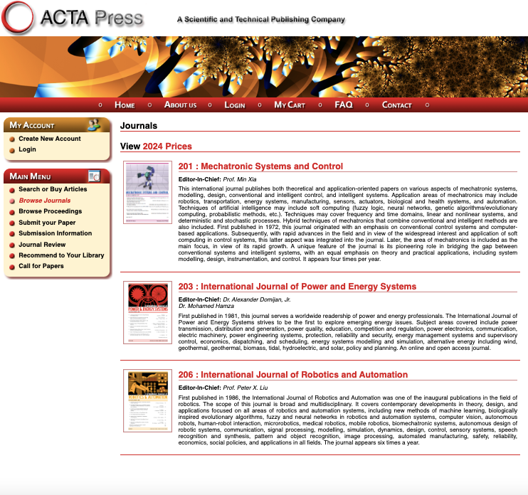
Original Design — As you can see, the original design was built in 2003. Gradient drop shadow boxes make up the navigation, unnecessary lines divide every section, and the font colors lack clear distinction or purpose.
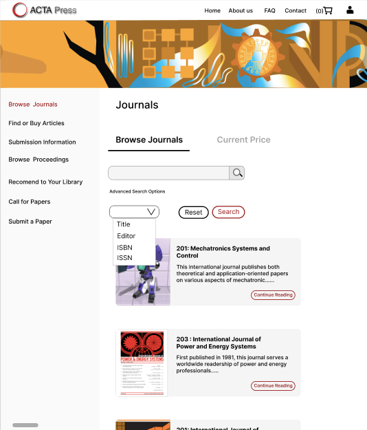
Modern Take — The design the developer and I created using Figma offers a much fresher experience for the Acta Press site. The old navigation was replaced with simple text, unnecessary lines were eliminated and replaced with off-white boxes to indicate distinctions, and text and button colors were given clear purposes. Page redundancies were removed, search bars were added, and the main navigation was moved to the header.
Admin Panel Development
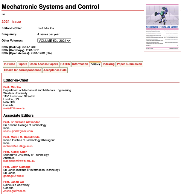
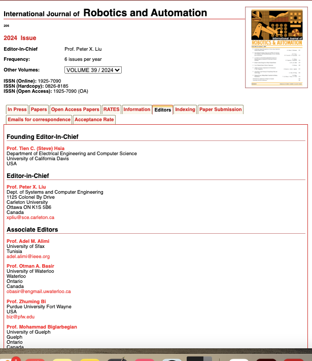
As you can see, the titles under 'Editors' vary depending on the journal (for example, the title 'Founding Editor-in-Chief' appears under Robotics and Automation but not Mechatronic Systems). This created a challenge when developing the content management system because the admin would need some sort of control over the page formatting.
To solve this issue, the developer and I implemented a default hiding system. If a category wasn’t filled out by the admin, the corresponding title would automatically be hidden.
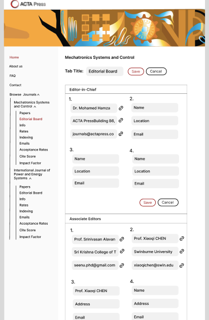
The image on the left shows the proposed editorial board section of the admin dashboard. The user controls the information that gets inputted, and any sections left blank are automatically hidden when the page is published.
Saving Space with Iconography

Cluttered Tabs Section — This project required significant adjustments to the information, as each journal had its own attributes. The original design had titles stacked in the tabs section, making it look cluttered, dense, and jarring.
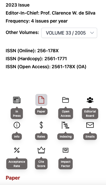
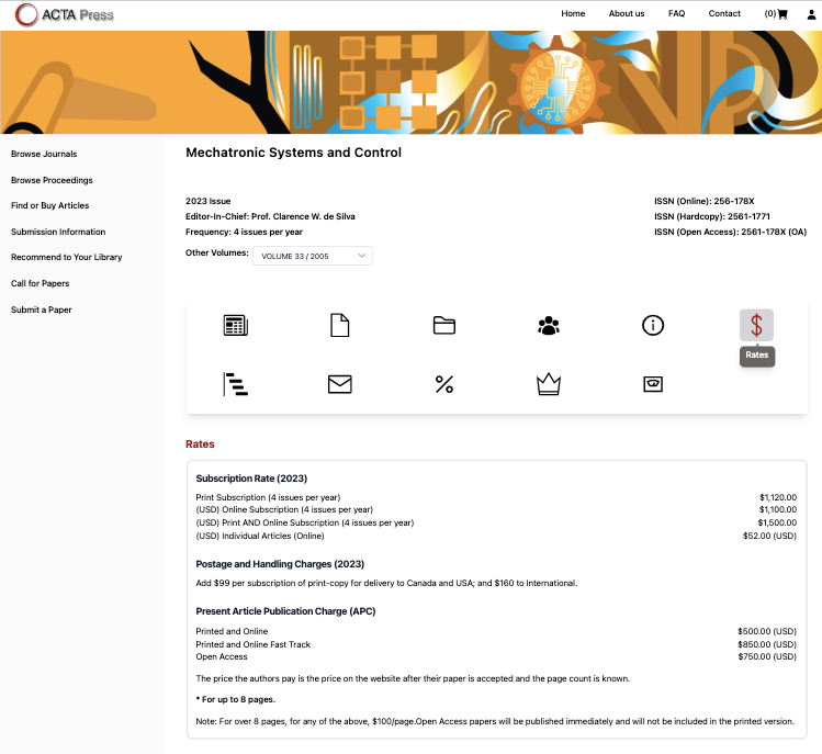
Decluttering with Icon — I came up with the idea to use icons instead of densely written tabs. The key feature is that when the user hovers over each icon with their mouse, a title appears.
Solutions for Smartphone Users — Since hovering isn’t possible on smartphones, the developer and I decided to have the titles appear automatically when the user taps the section.
Graphic Design

Original Hero Image — The original hero image for the site is jarring abstract and doesn't say much about about the site and it's content.


New Hero Images — The new images offer images that are relevant subject matter, making them better aligned with the site’s content.

I created this image for a learning robots presentation. All illustrations are custom-made and made in illustrator.
